Minesweeper Genius

Help Aristotle – the genius with a broom – sweep the minefield to regain his memory and escape from the aliens' scientific experiments, discovering where all the bombs are hidden.

Inspired by the classic computer game from our childhood - as well as Sudoku and Picross - Minesweeper Genius is a brain teaser that will challenge your mind and logical thinking. It is a game without guessing or luck.

Minesweeper Genius was made in 2016 by Mgaia Studio - a brazilian indie game company. The game can be found in the mobile stores as well as in the Nintendo Switch, Xbox One, and PlayStation 4 platforms.

_tldr

-level designer with focus on level progression
-tutorial development with user experience in mind
-feature design
-made in Unity

Mobirise

_responsibilities

i worked as a level designer, made the level progression and designed the tutorial.
initially i was designing the levels themselves, but after some playtest and thoughts, the team decided that having a procedural level generator would fit the game scope better.

my role as the level designer was to establish how the progression would take form through the game - taking into consideration the learning curve and how new elements would be presented, as well as how the game would appear challenging in a way that make sense.

_process: tutorial

in the other projects I've spoken about level design with puzzles, and about how to design with combat as the point of departure.

in this one I'll talk about how we designed a tutorial that would teach the player our game without using words.

a little context: this project started with an open monetization direction. it was first thought to be a mobile game. we didn't know if we wanted it to be free and the player would buy more life to keep playing, or if we would have a premium version wherethe user buys the product one time.

Mobirise

we knew that if we made that if we made the game freemium, the user would have no attachment to it. if the player didn't like it in the first minutes of gameplay, or even worse, if the user didn't understand how to play, the game would be very likely to be uninstalled right away. therefore, to minimize the chance of the game being deleted before the actual gameplay, we needed it to be easy to understand.

the first tacit rule is: no one reads pop-ups or texts in games. unless the game is a Grand-Strategy-like, players don't have patience to read how to play. so, how do we teach how to play a game that consist in reading the information to be able to make a move?

Mobirise

the tutorial version that we came to after a few attempts consisted of creating context for the game elements that were on the screen. there is a lot of different games, puzzles or match-3 games, that have scripted tutorials, that take the player by the hand and show how to play, by slowly showing what can be done, or the right way of doing things. but "showing the text", i think, is a different way of creating context.

creating context is to establish the border of how far you can interpret an element. (i remember that) one of the inspirations was the battlefied 1 prologue. here the tutorial is to teach the basic of moving, controlling the camera and using the action buttons. the creation of context here is to set how these events should be seen. 

in battlefield 1 prologue, the players' fate is to fail the mission, and to die several times while attempting to achieve success. every time the player dies, the game shows a different name, and the date of birth and death of the soldier that you embodied there. the context here creates a very strong narrative mood, but it also has strong mechanics demonstration. these attempts shows how fast the character dies in combat, how fast it can move, how to use weapons. and by doing so, the player can understand: "ok, i can't run until that other cover in such open space" or "ok, while i don't know how far a grenade explosion goes, i should be more generous with the distance". my point is: just moving the character in a totally safe space does not give total understanding of the movement of your character. knowing how you can fail shapes your notion of the mechanics. this tutorial is 12/12.

Mobirise

ok, our tutorial:

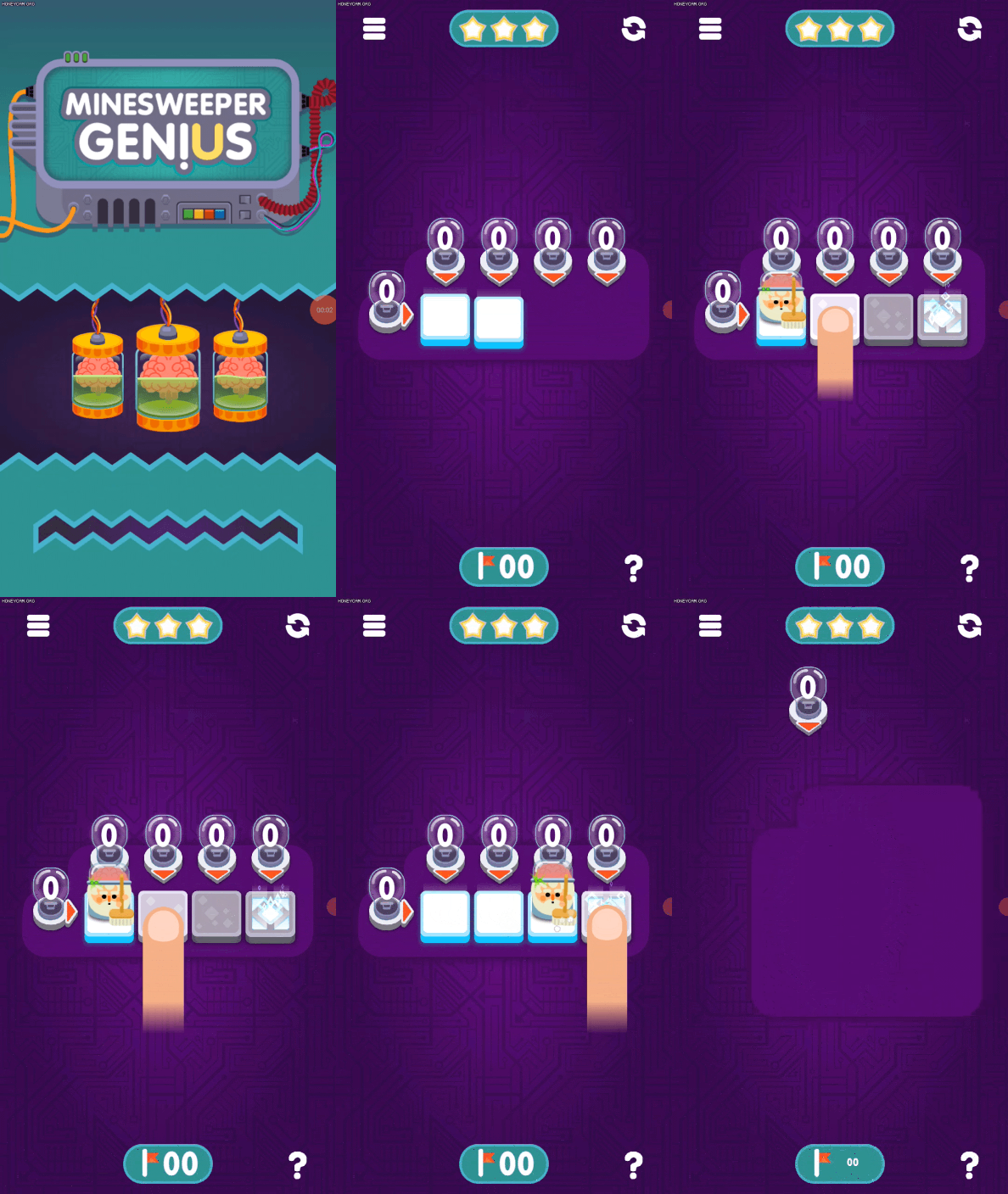
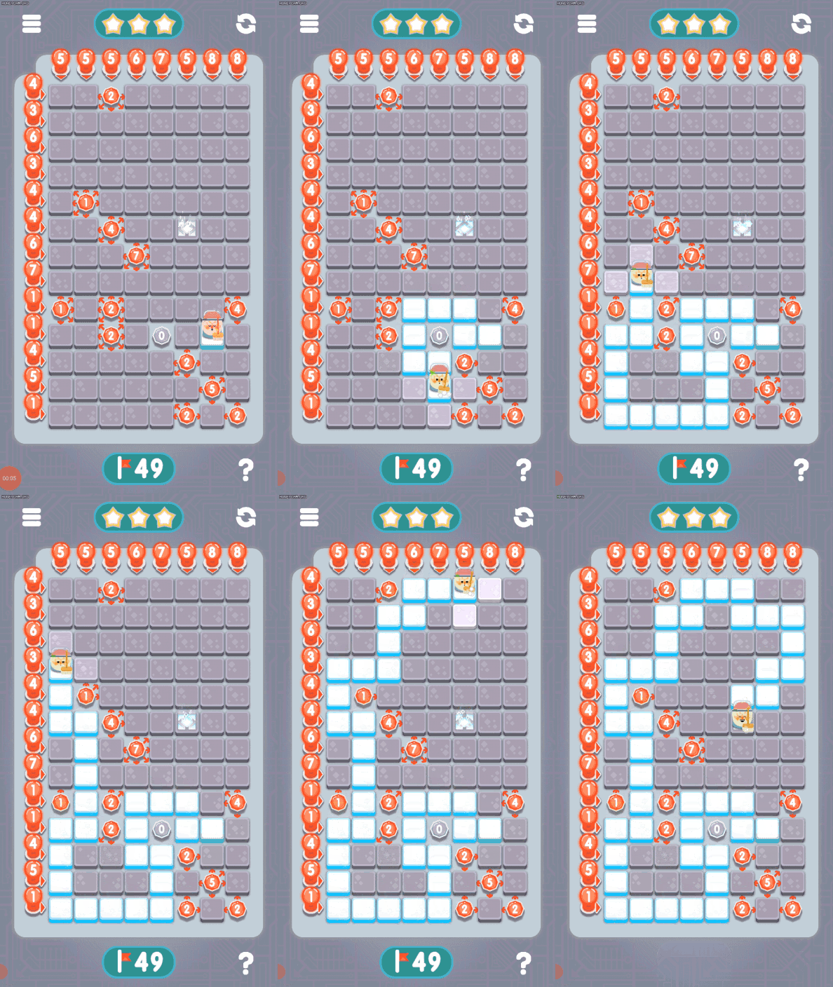
first, we show is how to move the character on the screen. that's basically the only interaction you have in the game. this is done by displaying a finger representation "clicking" on the neighbour block occupied by the character. As the player clicks on the same spot as the finger, the character moves. the player does this until they reaches the final block, which is the goal block.

while we are teaching how to move, all the game elements are present from the start. you have the blocks, which consist of the interactive parts, and you have the lightbulbs in the side of the grid, which at this point don't indicate anything but their presence.

Mobirise

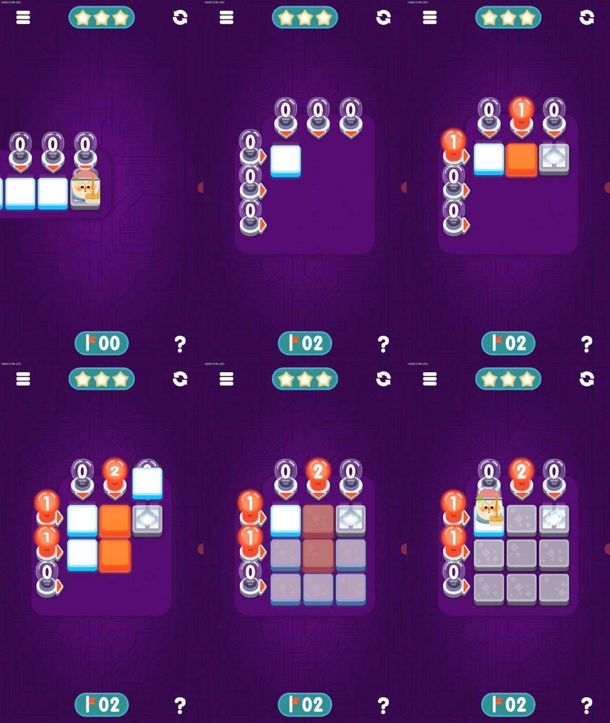
after the player reaches the first goal block a new level is generated. only at this moment, we see the level being built very slowly. here, as the blocks go down, we see their true colors, blue for safe house, red for bomb. and as the red blocks fall in their house, they add +1 to the corresponding column and row. after the whole grid is complete, it goes in the default gray colors. the player can now start understanding the relation between the blocks and the bulbs.

we tried leaving the red and blue blocks available on the tutorial for the whole time. but what happened was that the players would then look only to the blocks and not to the lightbulbs, and when they left the tutorial part, they would not understand what was going on, as it didn't link the information on the bulbs with the amount on the blocks.


Mobirise

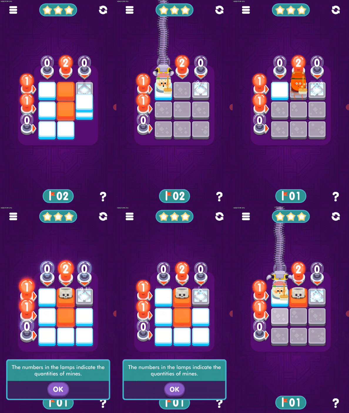
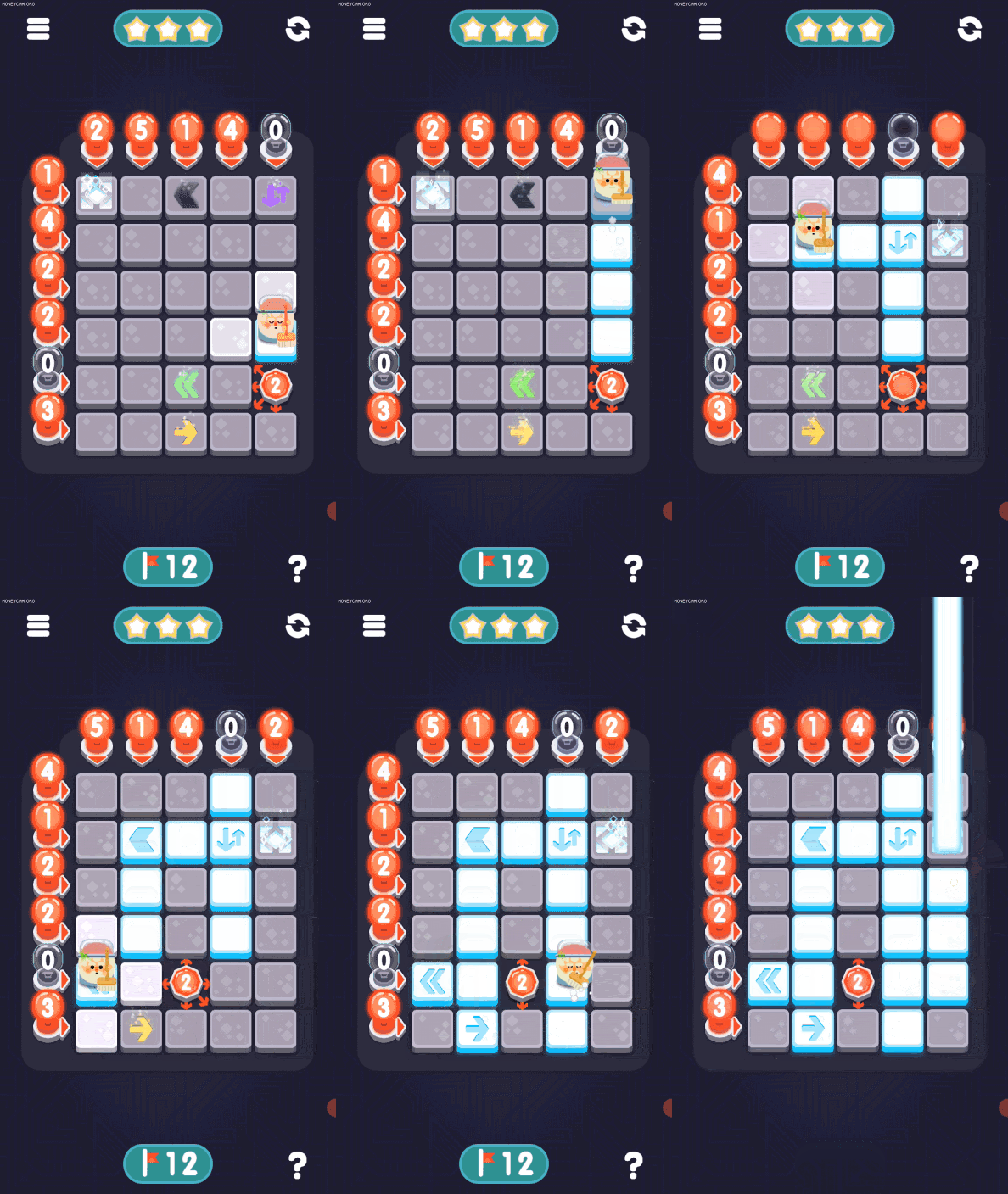
if the player makes the move to red, then it will fail. the game will stop, and will highlight the red blocks together with the lightbulbs. a small text will appear to explain what happened if the grid highlight animation wasn't enough. 

while we understand that the players don't read, we notice that they are much more inclined to read when they fail for some reason. It makes the player step out of whatever thought they were having and reevaluate. If I can use an image to explain, it would be: they found a wall in a dark room.

Mobirise


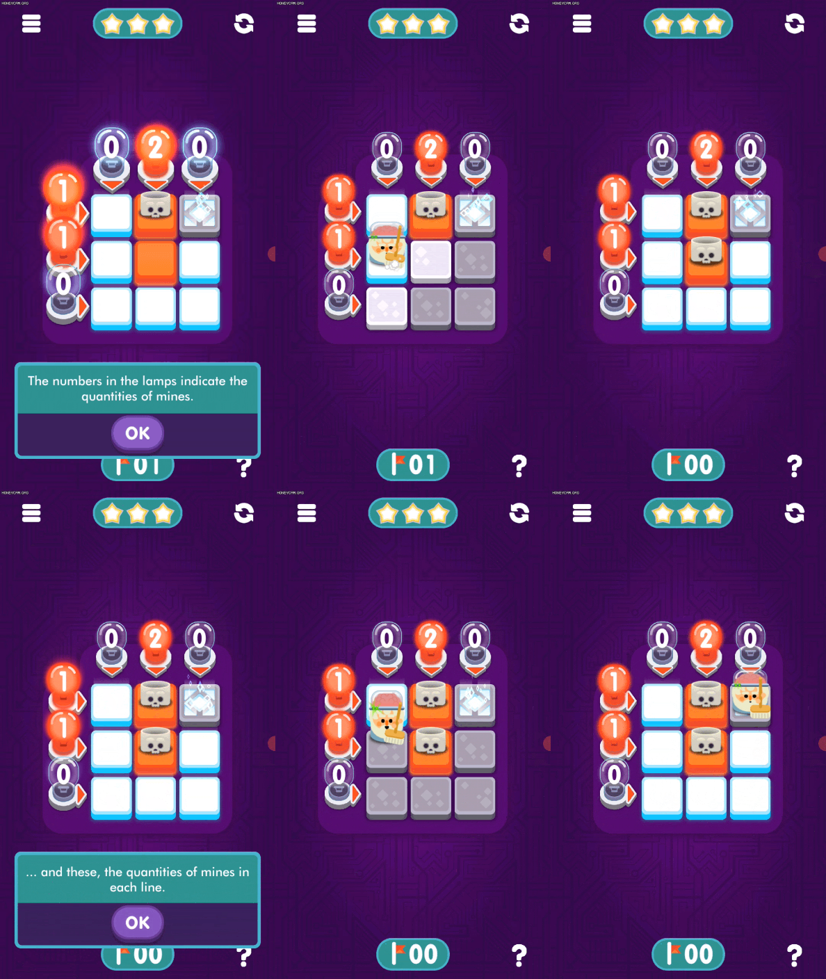
if the player falls again into a new read block, we can bring the same explanation even further by showing the player how rows and columns works.

the last resource is an interrogation mark that, when pressed, displays a written explanation of the game mechanics. this is a reinforcing measure, that can be consulted as well in different moments of the game.

the whole tutorial takes less than 3 minutes to complete. this was the most successful tutorial we found for our game. most people, when they found that they failed would back down and try to understand and not necessarily be frustrated.

also, the reviews of the game have shown us that we were successful with a broader audience as well.

_reflections.snoitcelfer

this game gets easier when you get to the end of the level. this is a very common effect in other strategy games, mainly in games where you expand your territory (or map the bombs in our case), like the Civilization or Total War franchise. these other strategy games have this "wrecking ball" state, that is harder to balance and which makes the game fairly uninteresting over half of the playthrough. this happens because the player finds themselves too big or too strong to fail, rarely with other opponents with the same size that can stand up to the challenge. normally, it is just the initial turns that have a real strategy component, as the player needs to find ways to establish themself, managing the economy, picking up the winnable fights, performing well in the battles.

one way these games, e.g. total war, tries to balance this is by having specific events that trigger in later on the campaign (or level in our case). in the Mortal Empires campaign in Total War, when players reach a certain empire size, the Chaos faction spawn in the map, with enough armies to raze down everything on their way. this is very hard to balance, as initially they had this trigger not by empire size, but by turns passed in game. so, what would happen is that now and then the player would find themselves not in the conquering phase, but in the phase of securing their own zone, and therefore they would be overwhelmed by the enemy. anyway, the idea is to make the game interesting in later moments on the of that game run. after all it is kind of "un-epic" for such games to be pretty boring at the end.

noticing that our game has a similar effect: it gets much easier to make a move at the end, than in the beginning where any direction might have a hidden path. i had some ideas that could change this effect and make it more interesting. but we went for another direction for several reasons that are unimportant to address here. but i think it is worth registering it.


Mobirise

like in the other games i have mentioned, in this game it is at the beginning that the hardest choices are made, as everything else around the player is a potential red block. the problem of having a lot of hidden blocks at the start, is that there is a lot of ambiguous information. "there are 8 red blocks in the row that I am i, 6 on the row to the left, 7 to the right. same thing for the columns. does the path make a turn around on the grid later to the right, to the left, or even is a straight path to the end?"

to solve this ambiguity in the start, we came up with the radial lightbulb. this makes that the game have no guess or luck involved. not in a single moment. how does the game do that?

when it finishes generating the path, it goes step by step and looks if the next move - and just the very next move -  is a safe house by converging the information on the lightbulbs. if it can't say for sure that there is a safe house on the next move, it drops this radial light bulb on the grid. it drops the radial bulb where it assumes that the drop will also remove the ambiguity. at the same time the radial bulb indicates how many bombs there are around it. (we should give a hand of applause for the game programmer). but the side effect of this solution is that: now and then we have this sequence of radial lightbulbs, which at the same time as it is an informational agent is also a physical agent. it removes the ambiguity, and at the same time gives more information. but it creates a hard path. the players knows that the path must go around it, as it removes a possible house.


the radial lightbulb was the solution we found so that the game had no luck element. but it created an unpredicted problem as it occupies a house on the grid. one solution would be to break down these two characteristics of the radial lightbulb. one could be a consumable, or an information in-block that would display how many bombs are around that target, including itself. or anything in these terms. and the other would have an element that simply blocks the path. even if the player never goes there, by crossing the rows and columns, there is one less house with the possibility of having a bomb.

and by solving the initial game design flaw, we made the difference in the feeling of difficulty, between the beginning and the end of a level, relatively smaller. but so far we don't have any element that can solve this wrecking ball effect entirely, because all of our mechanics are directed to the only dynamic that the game has: stop at a house and read only the information related to the next move.

Mobirise


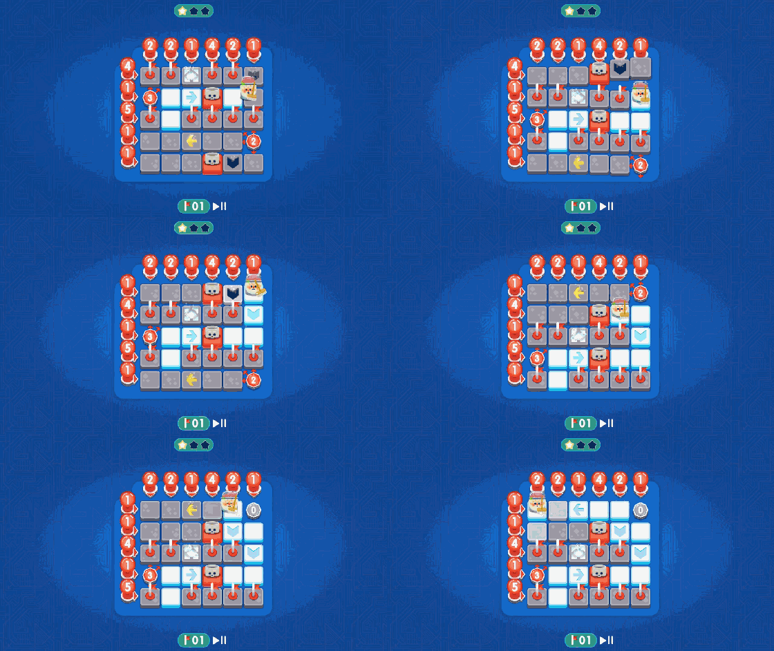
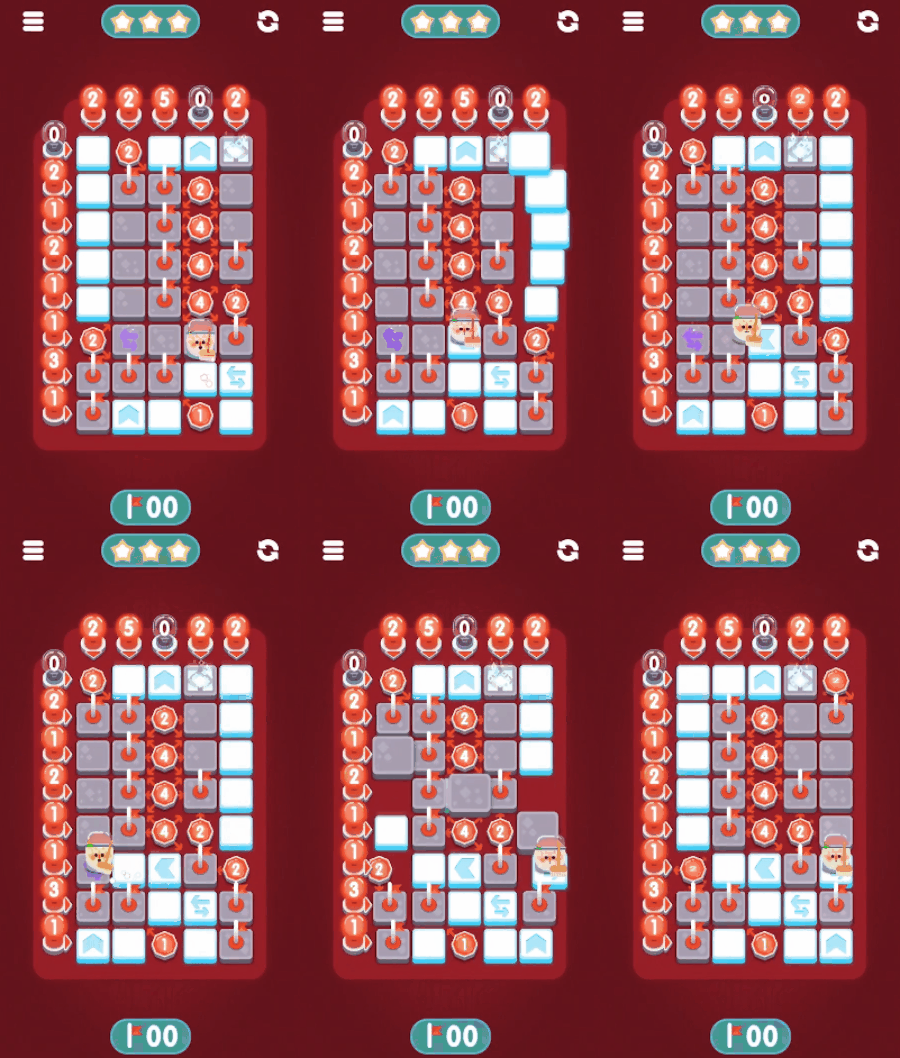
the inherent nature of the other special blocks displayed here shows that the blocks always does two things. shows that doesn't have a red block on it, making easier to read the row and column where it is found. and that you will move to it. what the special block do is when the player arrives on any of them, they rearrange the grid, and then the information changes together with the grid. but as the grid rearrangement doesn't change the quantity of red blocks distributed, it also does not change the pace of the player or the ratio of red blocks and safe blocks.

other forms to make the challenge re-appear in the end would be to find elements are that not necessarily hitting the information decoding aspect, but the other marginal game dynamics. like how fast the player can read, or some shell game variation.

but we know that people are very bad at keeping information that will be used briefly and just for a short time. in addition to that, if you require the player to share the same "processing brain space", like paying attention to: how to time the character's move with another in game element, it is much more likely for the player to fail than to actually find pleasure in performing both actions. this example is just to say, how this dynamic could work for memory exercise, but not necessarily adding to the fun of the game.

if we get back to our initial point: the wrecking ball effect, through an improvement of our existing elements, this would still not fix the problem. more elements as the special blocks like teleport blocks or mixing the available blocks, would require a fine tuning of the level generator algorithm and would change the fact that as you get closer to the end, the path becomes more clear. we would have to design extra systems that would make the game more complex. mechanics as timing moving, flipping grids, destroying bulbs.
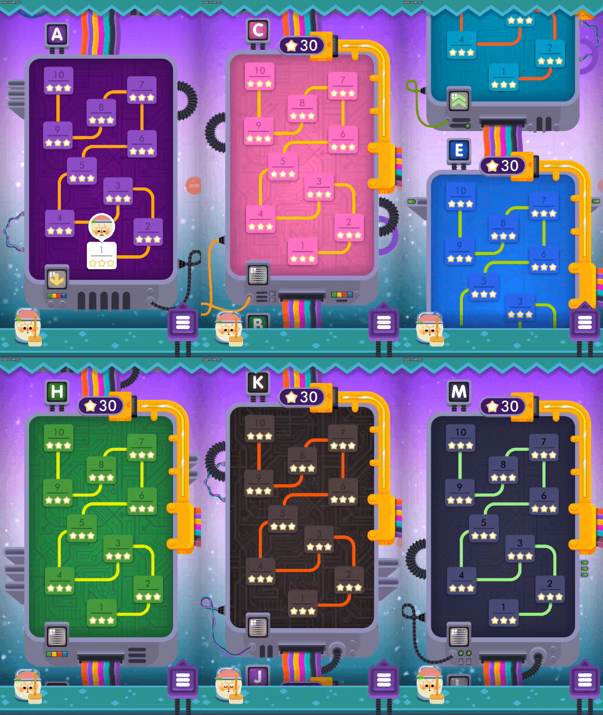
of course, the argument made here is not tackling another discussion that goes in parallels to the game design one. the discussion is about who the player is and where the game has to go to fit their leisure. we got to ask if the wrecking ball effect is a problem when you think about: where do people play this game? if it is as imagined, a passtime game, to be played maybe while travelling from work to home, there is no need for the game to be harder and harder at the end of a maximum 2 minutes level. or: the play session, by being smaller, might be a better fit for the overall audience.

but who knows to whom and what a Minesweeper Genius 2 can be?

thank you for reading :)

Mobirise

marcel barboza

The site was built with Mobirise website themes