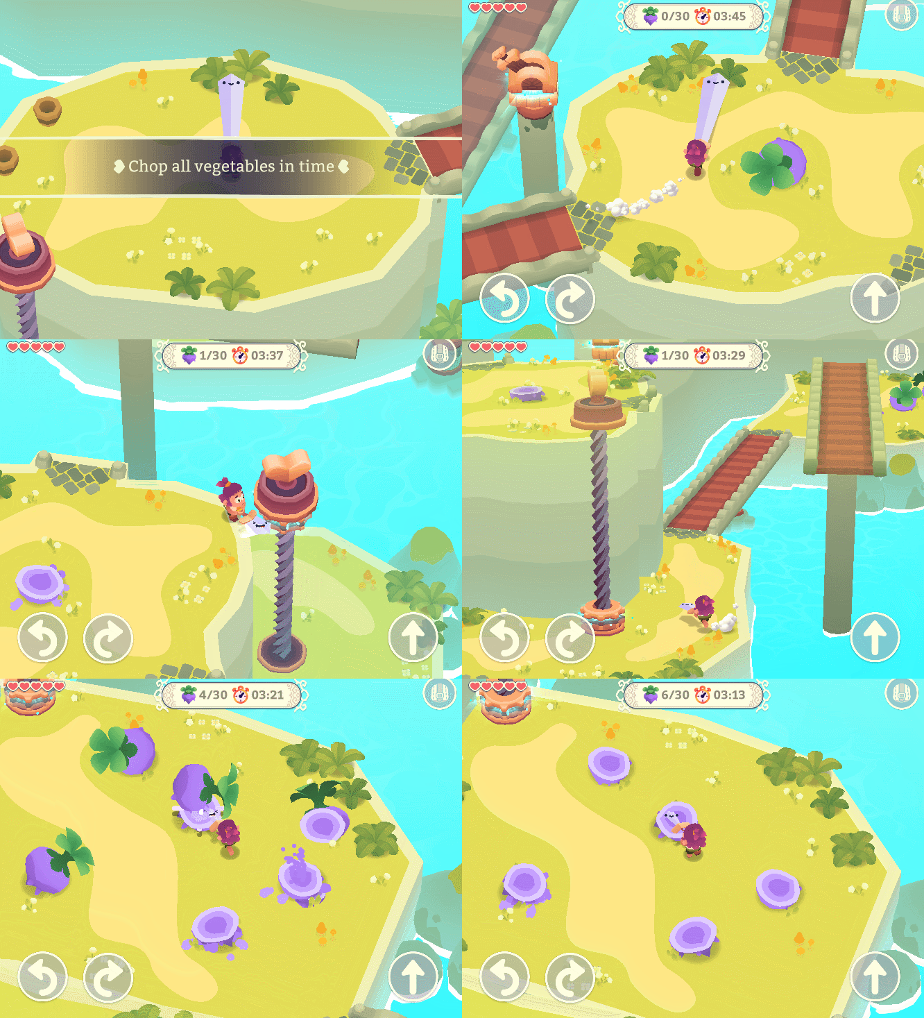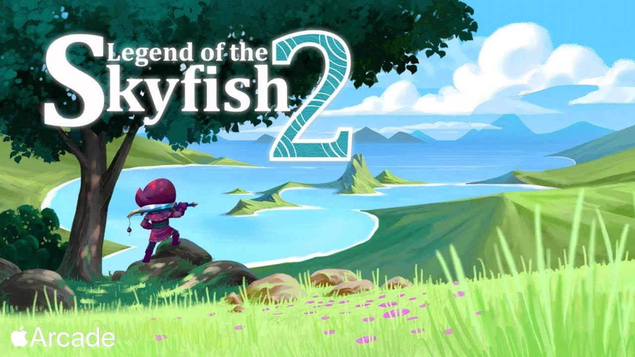
Legend of The Skyfish 2

A hundred years have passed since the hero known as Little Red Hook ended the reign of terror of Skyfish, the Lord of the Deep Seas… and now the peace that civilization struggled so much to build is in danger again.

As the last Red Hook guardians, you and your master must use the atypical tool of your clan – the Combat Fishing Pole – as both a weapon and a grappling hook to face the rising threat.

Unveil an exciting story as you journey in a world full of intriguing characters and devious traps. Explore gorgeous landscapes and mysterious dungeons while defeating mutant abyssal creatures.

this is a bigger game comparing it to its predecessor. More levels, more mechanics, more story, multiple items, bonus levels, back and forth in different levels, through different environments, different weapons. It is an Apple Arcade exclusive.

_tldr

-level designer with focus on puzzle and combat
-made in Unity

_history

the history here is my version of the facts. 

which doesn't mean that there is a controversial story behind this game. just means that I didn't ping pong it back to the other people that worked on this game.

the game was made by Mgaia Studio, a small brazilian company. they called to work as a level designer halfway through the project. i was working on with it until i had to leave to start my Master degree at IT University of Copenhagen.

_responsibilities

i worked as level designer. i developed the second campaign, and the initial bit of the third one, and developed extra hard extra levels.

Mobirise

_process

this is a personal and general method to all projects involved here. designing design a level requires at least two things: the level essence and what it will require to give form to its matter.

the "raison d'être" of the level is to have a clear goal of why your are designing a specific level in a specific way. is it to explore a mechanic? is to teach a new concept? is it to design around a specific experience, as fast paced level?

when this high pitch for the level is set, comes the part of stressing the mechanics that were selected to be part of the level. to find the combinations with different elements. to see how the controllers feel when interacting with it. to find the design space for creating the level.
Mobirise

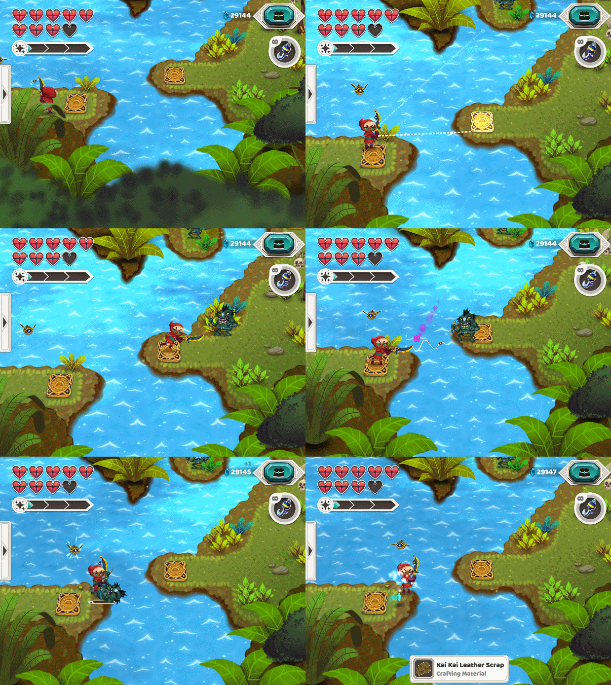
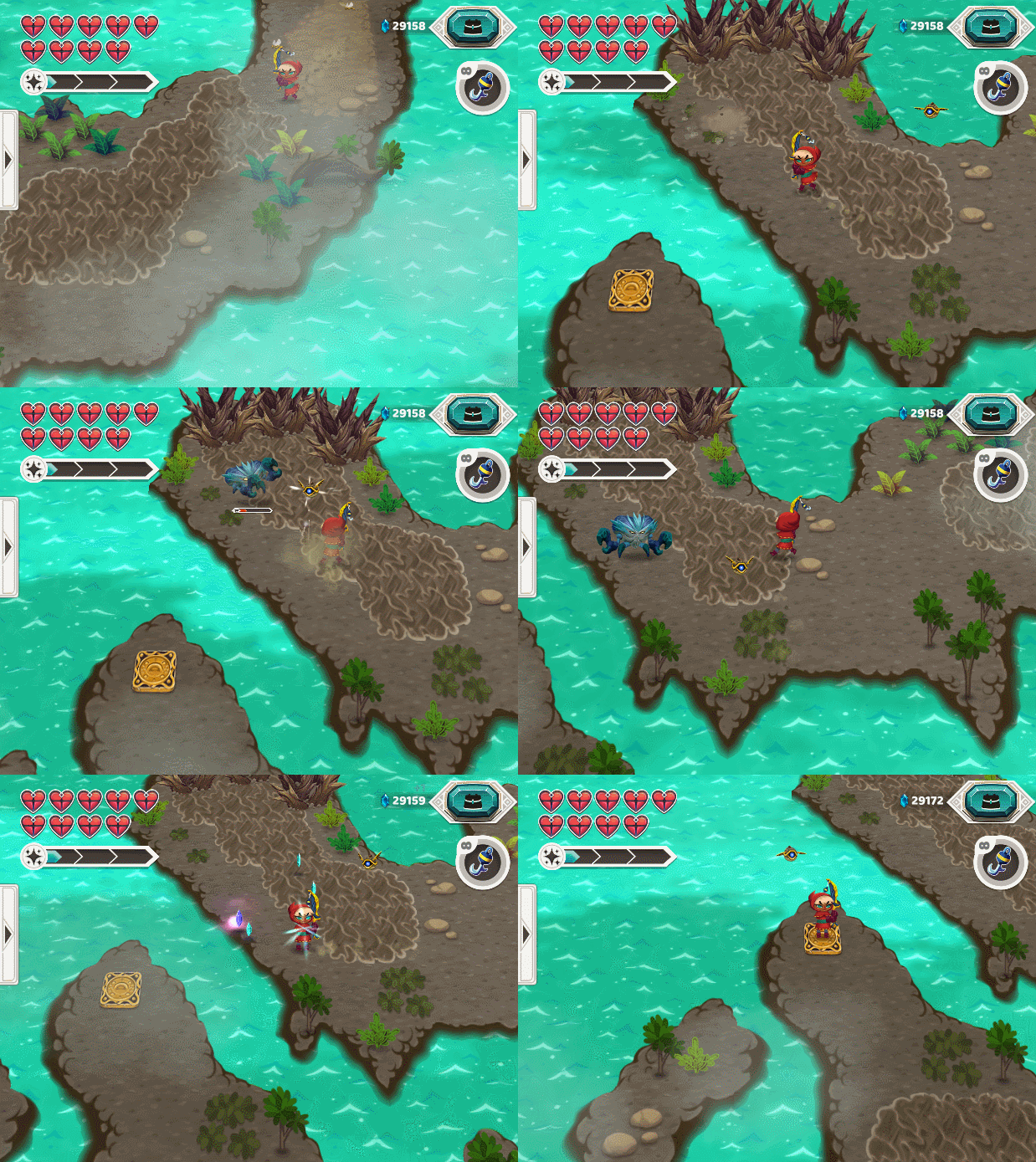
in the other project, Skyfish 1, i've talked a little about how i explore puzzle elements. in this one i'll give some perspective on how to think about enemies and space. Or designing for combat! 

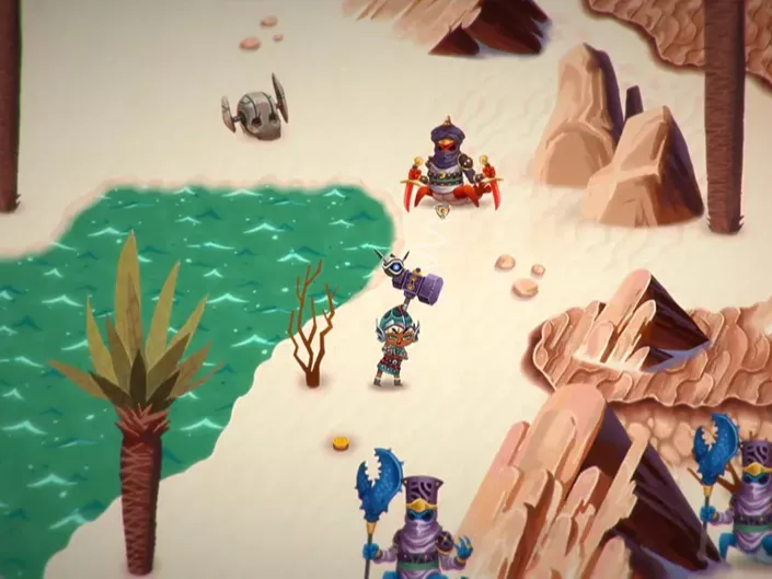
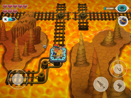
this title had controllers and mechanics designed for improving the combat. Auto-aim, combo attacks, different weapons and side gadgets.

not only that, enemies also has more interesting attacks and movements, such as jumping backwards before receiving damage, teleporting, resistance shields, summoning minions.


Mobirise
Mobirise
Mobirise

while each different enemy have a unique trait, they were not designed to be overly complicated to face. the enemies were made in a way where the player could easily identify and understand how to fight them

then, it was through level design the variation was made. creating different experiences with the enemies through topology and traps.

As it was still thought to be played on touch screens devices, the gameplay should not require too much dexterity. Another factor considered was to always justify the use of the fishing pole.

as the fishing pole have now an auto-aim feature, the placement of hatches can be used in combat to give the player mobility to get to the enemies faster, instead of being used just to move around through different areas or as a puzzle solving mechanic.

Mobirise

however, the auto aim creates a new issue, it works very well with close objects, but the further the element is, the harder it is to control each object it will potentially attach to.

therefore it requires to think about each moment when designing, and consider what elements are going to be around the player as they move forward.

Mobirise
Mobirise

_reflections

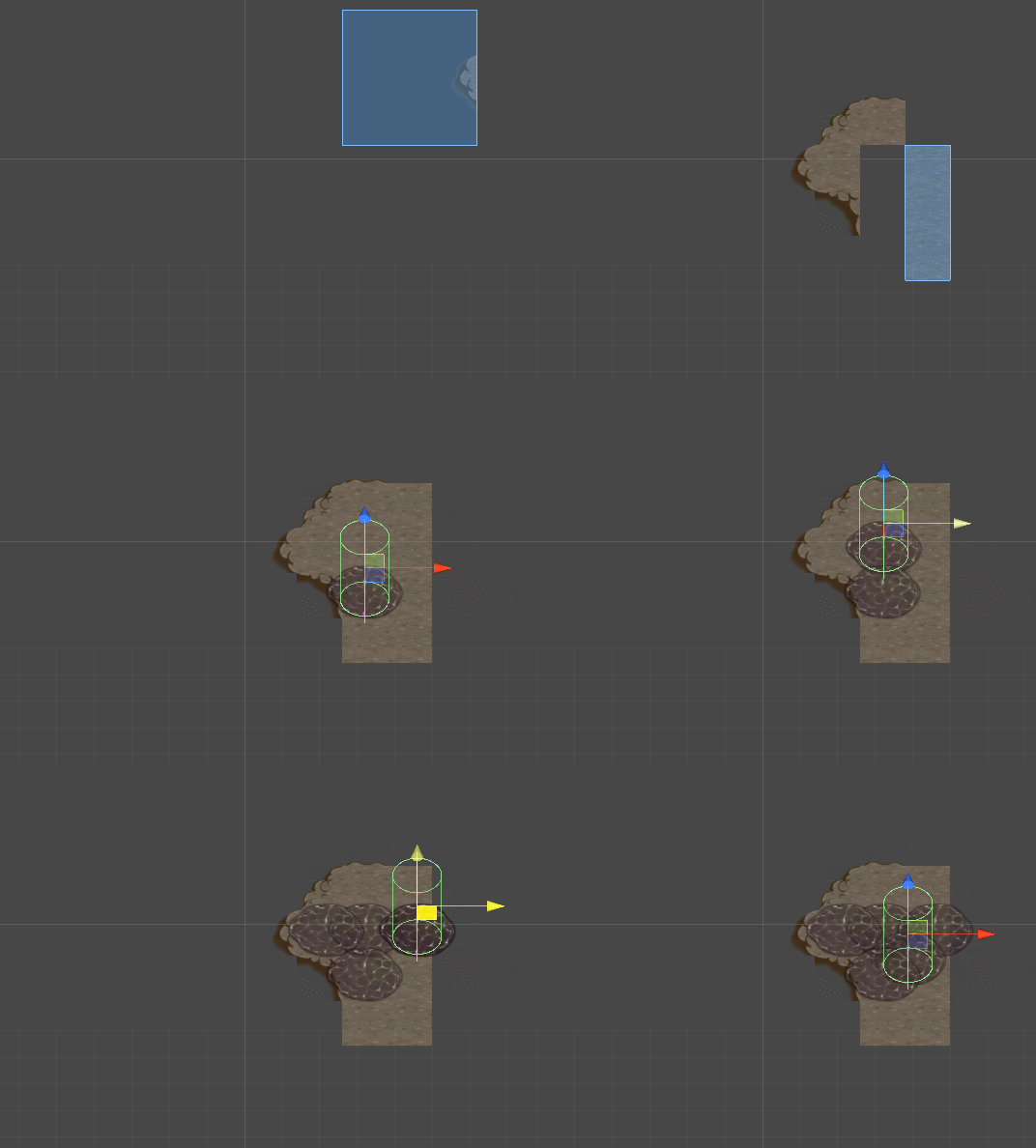
an interesting thought came to me while working on this project, that in some degree reflects on my design process. the game has two different nature of the objects, that each gives the game space its shape. first, the topology, that follows a pure tile placement. second, all the other elements that populate the world, and that are not bound to the grid and therefore move freely in the space.

this, of course, isn't new. if you take the very first tomb-raider games, it was a platform-like puzzle. in a lot of its gameplay, it had a 3D tile grid, that required the player to position themselves in a very specifik way to move correctly. while in combat moments it had all the 3D movements controls.

the topology following the grid made it easier to understand what the player can see, as the grid has a ratio the same as the screen size. as you get in the corner of the camera, you need to lock the grid with specific tile borders to prevent the player from reaching it.

Mobirise

but as the player can move freely on the grid, if you create a new "island", that requires the player to use the hatch to get there, only the tile gives the measure of movement.

the creation of the world was a mere stage. maybe next time, we should make the tools to create the space through interactions relations, rather than filling the space with objects.

it is like designing a chess game where the pieces can move freely. it does not necessarily make the game better. maybe this is one of those ways of thinking that comes from actively engaging with a technique. 

thank you for reading :)

Mobirise

marcel barboza

https://mobirise.com best site creator